
DePaul IMPACT Grant / PUSH Studio
ARC — A new way to experience campus
An augmented reality prototype for prospective students exploring DePaul’s Lincoln Park campus.
- Role
- User Experience Design Intern
- Team
- 4 students: 2 HCI, 1 game design, 1 animation
- Timeline
- Summer–Fall 2025
- Skills
- UX research, interaction design, AR prototyping, usability testing, Unity
Overview
Helping visitors get to know campus.
Project context
In summer 2025, we built on PUSH Studio’s concept prototype and earlier co-design with tour guides and students. We explored what AR could add to a guided tour and to a visit on your own.
My contribution
My HCI partner and I developed the personas, campus content, user flows, and interface. I also co-authored the usability protocol, analyzed session records remotely, expanded the UI library, and improved the Figma-to-Unity handoff.
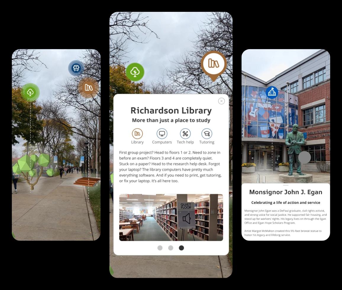
Four ways to explore campus in AR.
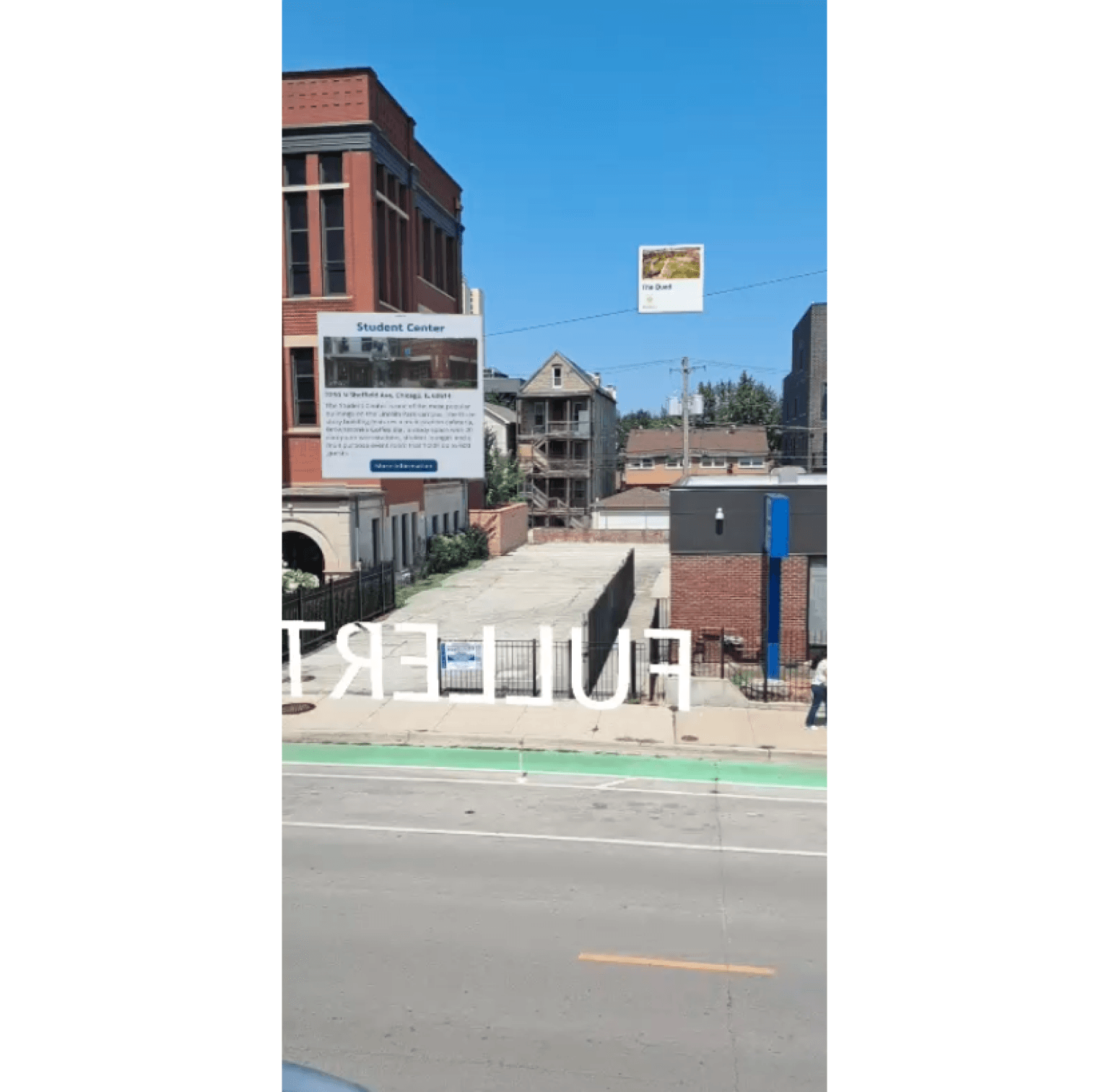
The prototype used the camera view to show campus information in place.
Buildings
See what a building offers, from resources to student perspectives.
Landmarks
Read a statue’s story while keeping the artwork in view.
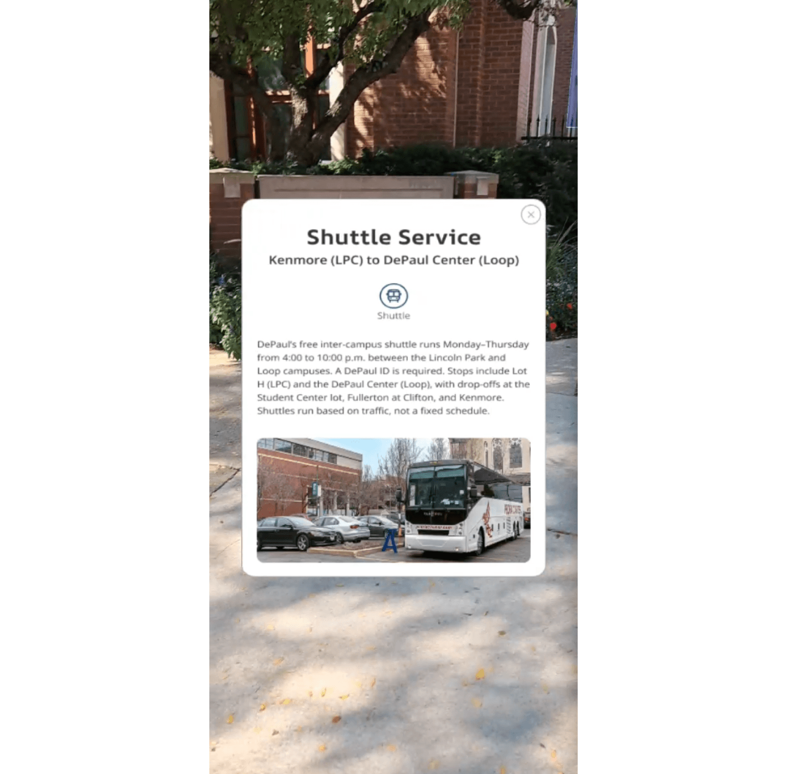
Shuttles
Find stops and routes for travel between campuses.
Emergency call boxes
A blue light highlights the location of a physical call box.
Summer 2025 prototype views · Lincoln Park campus
Research
Two perspectives shaped the campus experience.
My HCI partner and I reviewed earlier project research. We each developed a persona and mapped that person’s campus visit.
Research inputs
We gathered material from the previous design team’s focus groups, interviews, and storyboards.
Two visitor profiles
Oscar focuses on independent exploration. Steph focuses on safety and transportation.
Design implication
The profiles helped us decide which information to show during a campus visit.
Oscar
- Age: 18
- Location: Bettendorf, Iowa
- Education: High school senior
- AR familiarity: Low to moderate
“I love how lively the campus is, but it feels like a maze right now. I just want to feel more confident exploring it on my own.”
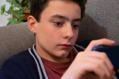
Bio
Oscar is a high school senior who wants to study computer science. As he and his mom tour several universities, Oscar is excited by the idea of moving to a big city and experiencing life beyond his small hometown. He’s focused on finding a campus that feels welcoming and easy to navigate, especially in a fast-paced urban environment. Exploring unfamiliar spaces can feel overwhelming, so he values tools that help him understand his surroundings, learn, and explore while staying oriented, and gain a sense of independence as he imagines his future in college.
Frustrations
- Feels overwhelmed by the urban layout and unfamiliarity of a large, city-integrated campus
- Wants to explore independently but doesn’t feel confident navigating without guidance
Goals
- Understand the campus layout and what’s inside key buildings
- Feel more confident and less anxious about navigating a city-based college environment
Personality Traits
- Curious
- Introverted
- Prepared
- Open-minded
Desires
- Freedom, 88%
- Clarity, 61%
- Insights, 61%
From Oscar’s needs to the design
Oscar’s journey moves from a guided tour to exploring on his own. We used that shift to plan markers he could recognize, building information he could open, and a clear way back to the campus view.
“Exploring an unfamiliar urban campus with the help of an ARC to feel more confident about navigating and fitting in at DePaul.” Stage 1, Anticipation and First Impression. Actions: Oscar visits DePaul’s Lincoln Park campus with his mom. Upon arrival, he takes in the busy, urban environment and immediately notices how different DePaul feels from other campuses. He observes that the campus is integrated into the Lincoln Park neighborhood, surrounded by shops, traffic, and city life. Thoughts: “This doesn’t feel like the typical college campus, it’s like the school is part of the city itself. I’m just trying to figure out how it all fits together.” Emotions: Feeling intrigued, and a little overwhelmed and anxious. Stage 2, Begin Tour and Using ARC Application. Actions: Oscar arrives at the campus tour office, ready to begin the tour. He is instructed to download and open the Augmented Reality Campus (ARC) app. As he follows the tour guide, he points his phone at streets and buildings, revealing 2D/3D signage and informational overlays about campus resources and statues. Thoughts: “It was cool seeing the buildings come to life and finally knowing their purpose. Learning about DePaul’s history through the statues was also interesting.” Emotions: Feeling engaged, relieved, and intrigued. Stage 3, Independent Exploration. Actions: After completing the group tour, Oscar explores the campus further with his mom. Using the ARC app, he identifies building signage and visits the library to take a closer look. In the courtyard, he comes across a statue and reads more about its significance. They spend another 30 minutes freely roaming the campus with the app. Thoughts: “It was nice to take our time and explore on our own, using the app made it easy to understand what we were looking at.” Emotions: Feeling adventurous, curious, and confident. Stage 4, Reflect and Envision. Actions: Oscar debriefs with his mom about the resources they explored during the campus visit. He shares his thoughts and begins imagining what student life at DePaul could look like. Thoughts: “Now that I’ve seen everything, I can actually picture myself here, it feels like a place where I could really thrive.” Emotions: Feeling optimistic, satisfied, and reassured. Across the four stages, the emotion line on the map rises from the first stage to the last.
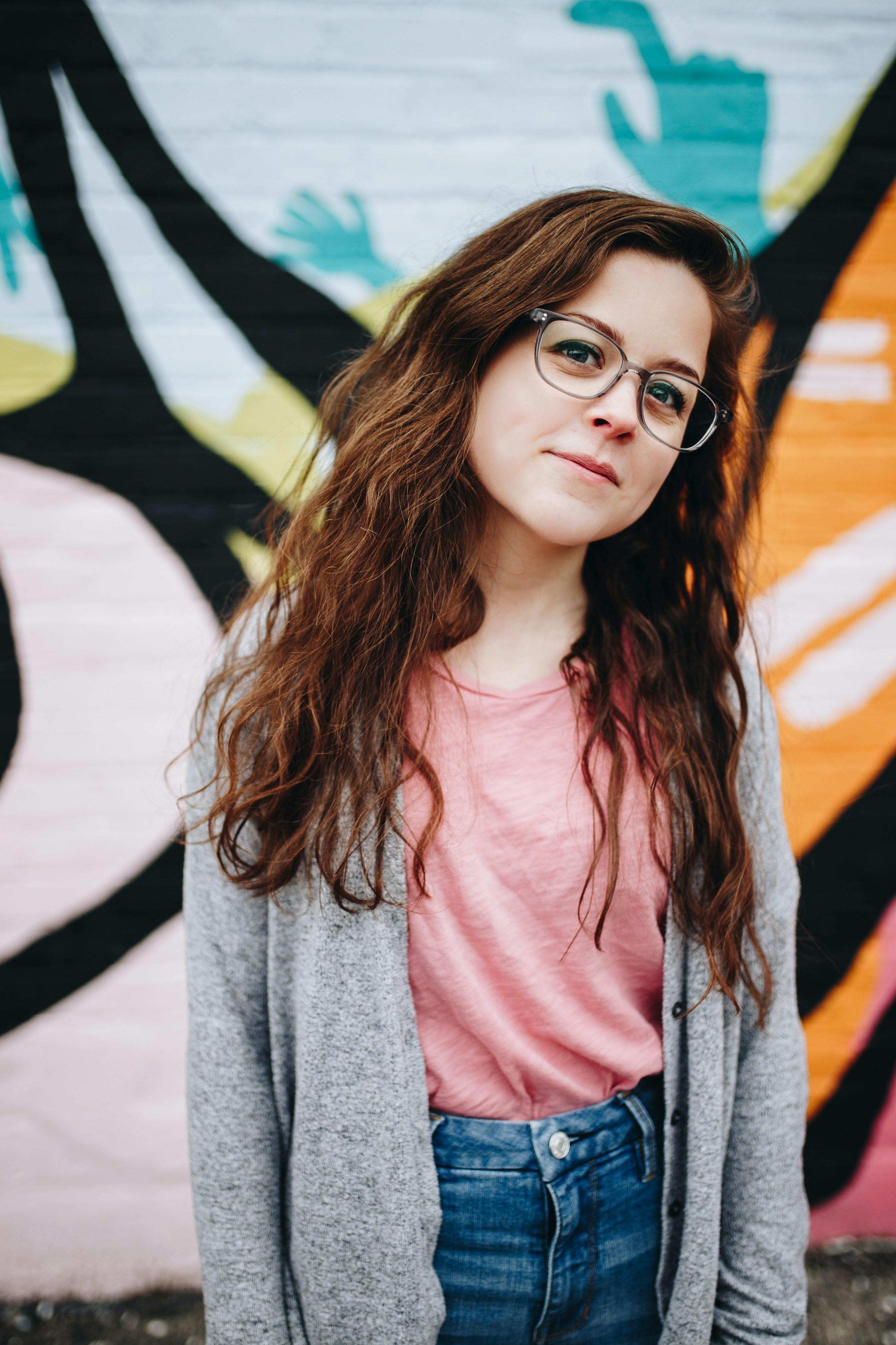
Definition
Mapping the tour to shape the content.
The guided tour gave us a reference for organizing campus content. AR guidelines helped us plan gestures, physical comfort, and awareness as visitors moved through campus.
01 Map the stops
Mapped 10 buildings, 2 statues, 3 shuttle stops, and 29 emergency call boxes against the guided-tour route.
02 Organize the information
Recorded each stop’s category, student perspectives, resources, amenities, and coordinates.
03 Identify icons and assets
Used the inventory to identify the icons and 2D/3D assets we needed.
Follow the route visitors already take.
The map numbers the tour’s stops. 10 buildings: Welcome Center, Clifton Hall, Clifton Parking Lot, The Quad, Richardson Library, Schmitt Academic Center, Arts and Letters Hall, Student Center, Sullivan Athletic Center, Ray Meyer Fitness and Recreation Center. 2 statues: Monsignor John J. Egan, St. Vincent’s Circle. 3 shuttle stops: Student Center (Lot H), Kenmore and Fullerton, South Side of Fullerton at Clifton. 29 blue-light emergency call boxes are marked across campus, including every floor of the parking garages.
Ideation
Connecting each campus stop to an interaction.
We used the content inventory to design a proposed flow: select a marker, explore its content, and return to the campus view.
Design
Bringing campus information into the camera view.
I explored marker and card options with the team, then refined the selected directions in Unity. We followed DePaul’s typography and color guidelines and updated the emergency call box cue’s label and color.
Key design moments
Use color to distinguish marker categories
I explored action buttons, dotted guides, and pulsing markers. We used color to distinguish categories of places and larger pins to make markers easier to notice.
Keep the statue visible
I proposed a drawer over a floating card so visitors could read the story while keeping the statue and its surroundings in view.
Make the place easy to notice and select.
Usability testing
Useful content needed clearer, more reliable interactions.
After internal testing, we used team feedback to refine the prototype. We then evaluated it on DePaul’s Lincoln Park campus with three current students and one visitor.
Method
In moderated sessions, we gave participants tasks and asked about accessibility, usefulness, and enjoyment.
My role
I co-authored the protocol and analyzed the records remotely. My HCI partner moderated the sessions with technical support from our developer.
Status of the refinements
The findings informed recommendations for a later iteration. We did not retest them.
Buildings
Observed
Participants valued the library details. One wanted more specific information about library resources and expected the description to change with the photos.
Proposed refinement
Separate the photo controls from the description and highlight specific library resources.
Landmarks
Observed
Marker failures and placement interrupted the task. Participants reported pointing the camera upward to find the marker.
Proposed refinement
Adjust marker placement, then test whether visitors can find it and open the card without prompts.
Shuttles
Observed
Participants valued information about traveling between campuses. One wanted to see service hours before opening the card.
Proposed refinement
Display operating hours and route information earlier, using confirmed service details.
Emergency call box cue
Observed
Participants saw little added value in the blue light. It highlighted the physical call box without offering a follow-up action. Some participants expected to tap it.
Open design question
What information or action, if any, would make the AR cue useful at a physical call box?
Study limits
The study used prompted tasks. When the live statue marker failed, we used a recording in some sessions. That feedback tells us about the statue content. It offers limited evidence about whether visitors could find and open the live card on their own.
Design system & handoff
A shared UI library for design and development.
I expanded our UI library with reusable markers, cards, and icons, plus rules for typography and color. I documented component states and interactions so our developer could refer to them in Unity.
Make each place type recognizable at a glance.
Map markers act as UI cues in the AR environment to highlight important buildings for the tour. Each marker uses a color associated with its building type; for example, academic buildings are blue to convey focus and learning. This color association reinforces recognition and allows users to easily identify building types at a glance. Each marker has a pulsing effect, which draws attention to key points of interest and helps guide users through the tour. Categories: Outdoor, green, with a tree; Academic Building, blue, with a building with a flag; Library, brown, with books; Gym, red, with a dumbbell; Classroom, yellow, with an open book with a pencil; Sports Center, orange, with a basketball hoop; Residential, purple, with a house; Shuttle Stop, dark navy, with a bus. States: Default: a solid circle in the category color with a white icon. Pulse one: the first frame of the pulse animation. Pulse two: a soft glow in the category color spreads around the circle. Pressed: the marker becomes a map pin, white with a colored outline and icon.
From manual asset transfers to one-click export.
Before
Our developer downloaded and uploaded assets one by one for each iteration. That slowed testing and made it harder to match the Figma designs in Unity.
What I changed
I researched and tested a Figma-to-Unity plugin, then shared the one-click export workflow. The imported UI looked clearer, but the scale was off. I checked component sizes in Unity and documented the correct dimensions.
Result
The importer reduced manual transfers. Correcting the scale brought the Unity interface closer to the Figma design and helped our developer test updates faster.
Project outcomes
What the summer work made possible.
The prototype reached formative testing on campus, and the Unity workflow supported faster iteration.
A prototype for on-campus testing
The prototype brought four types of campus information into the camera view for a formative usability study.
A question for the next study
Could prospective students find and use the AR content independently? A follow-up with this audience could test the revised interactions without prompts.
A simpler design handoff
One-click export replaced individual asset transfers. Documented component dimensions gave our developer a clearer reference for Unity.
Reflection
I learned to design beyond the Figma canvas.
Working with HCI, game design, and animation teammates taught me to account for implementation constraints as I designed. In Unity, I saw that scale and visual fidelity needed their own checks. I learned to update the UI library and handoff guidance as the prototype evolved.
After summer 2025
We revisited the product vision and technical constraints after the summer. We explored an invisible art gallery as a smaller, more controlled setting for AR. The campus tour project later ended.